Developer Doc
By using Ticwear Design Support Library (later referred to as the design lib), you can easily develop an app that meets Ticwear’s design guideline and supports novel interactions like Tickle.
Except Ticwear’s own unique interactions, other parts of work can be applied to Android Wear also.
Before you start using the design lib, you ought to set your Application Theme as either Theme.Ticwear or other derivative themes. Then you are able to use the various sorts of components in the design lib.
The design lib includes the following parts:
- Style and Theme: define a few styles of text, page or widgets, and transitions of pages.
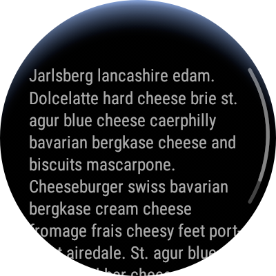
- Coordinator Layout: establish a set of page structure for wearables in addition to the scroll effect in Google Design and add the overscroll-bounce effect for the App bar based on Android Design Support.
- Support Tickle: provide developers a set of convenient methods to support Tickle, plus widgets that work better with Tickle, such as Ticklable RecycleView, Focusable LayoutManger, etc.
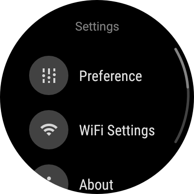
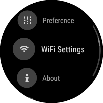
- Preference: provide a preference system like Android Settings to fit Ticwear Design. It works better on smartwatch, and supports Tickle interactions.
- Dialogs: we also provide a set of dialogs suitable on smartwatch, including Normal AlertDialog, Number Picker Dialog, Date & Time Picker Dialog, List Choice Dialog, etc.
- Floating Context Menu: Similar to Android’s FloatingContextMenu, create menu items via Menu resource, then use
FloatingContextMenuto load and display them, and get the callback of their selection. - Other Widgets: Ticwear provides a set of widgets suitable for wear, including ScalableTextView, FloatingActionButton, PrimaryButton, NumberPicker, DatetimePicker, and Checkbox, RadioButton, SimpleSwitch, etc.
Any of the content in the design lib can be demonstrated with “demo” App from the source code.
Style and Theme
Ticwear provides a set of themes that meet Ticwear design guideline. Developers can use or extends those themes, including:
Theme.Ticwear: Default theme of Ticwear Design that defines a series of styles for text, page, transitions, settings, etc.Theme.Ticwear.Dialog: applies tor dialogs on Ticwatch with Fullscreen display, swipe to dismiss with slide in/out transition.
Beside Themes, developers can also use the set of styles we have customized. Please refer to styles_ticwear.xml for more details.
List Styles
To acquire better user experience, please:
- Set a style pointing to
Widget.Ticwear.ListViewfor yourListView(orTickableRecyclerView, etc.) - Set a style pointing to
Widget.Ticwear.ListItemfor your list item container.
These two styles, has covered display or list view on smartwatch including the margin of top or bottom of the list, horizontal padding and click effect of list items, etc.
Text Styles
Ticwear defines a series of text styles that are all compatible with the Material Design Typography, including text size, line spacing, font, etc. (Given that “Display” font is too large for smartwatches, it is not defined here)
Ticwear Design has defined the styles as shown below:
TextAppearance.Ticwear
TextAppearance.Ticwear.Headline
TextAppearance.Ticwear.Title
TextAppearance.Ticwear.Title.Inverse
TextAppearance.Ticwear.Body2
TextAppearance.Ticwear.Body1
TextAppearance.Ticwear.Hint1
TextAppearance.Ticwear.Hint2
TextAppearance.Ticwear.Button
TextAppearance.Ticwear.Inverse

TextAppearance.Ticwear.Large
TextAppearance.Ticwear.Large.Inverse
TextAppearance.Ticwear.Medium
TextAppearance.Ticwear.Medium.Inverse
TextAppearance.Ticwear.Small
TextAppearance.Ticwear.Small.Inverse
TextAppearance.Ticwear.Widget
TextAppearance.Ticwear.Widget.Button
And, some basic font size:
<dimen name="tic_text_size_extra_extra_large">27sp</dimen>
<dimen name="tic_text_size_extra_large">20sp</dimen>
<dimen name="tic_text_size_large_1">18sp</dimen>
<dimen name="tic_text_size_large_2">17sp</dimen>
<dimen name="tic_text_size_medium_1">16sp</dimen>
<dimen name="tic_text_size_medium_2">15sp</dimen>
<dimen name="tic_text_size_small_1">14sp</dimen>
<dimen name="tic_text_size_small_2">13sp</dimen>
<dimen name="tic_text_size_extra_small">12sp</dimen>
Developers are free to use and combine the styles and sizes listed above.
TiColor palette
We provide a set of Ticwear-style palette resource for developers, allowing them to directly use a specific color through resource. The naming of basic colors conforms to the following format:
R.color.tic_basic_<name>{_<decorate>}
In this format, name means color’s name. All available color names are defined in ColorPalette.ColorName, corresponding with each specific color. And decorate implies a modification of color with three options to choose from: darken, lighten and normal. When decorate is not assigned, the default setting is normal.
In addition to directly using the resource files, developers are also able to acquire Ticwear colors via class ColorPalette programmatically:
- Call
ColorPalette.from(Context)to obtain a palette instance. - Use
ColorPalette.color(ColorName)to acquire a color object that corresponds withColorName. - If decorate is needed, call
ColorPalette.Color.lighten()orColorPalette.Color.darken()to acquire the modified color object.
If the current color can not assign modifications, it returns to the original state. For example, ‘Indigo’.darken().darken() equals to ‘Indigo Darken’.
- In the end, get the final color value through
ColorPalette.Color.value().
For example, if we need to acquire Indigo Darken as a modified color value, we need to call the following codes:
int color = ColorPalette.from(context)
                .color(ColorPalette.ColorName.INDIGO)
                .darken()
                .value();
Coordinator Layout
Similar to Android Design Support, Use CoordinatorLayout to structure AppBarLayout and other page content can let the App bar response to the scrolling of content, therefore achieving multiple effects.
Enable Circular Scroll Bar and Edge Effect
By using CoordinatorLayout to wrap the scrollable content, developers are able to acquire a circular scroll bar, a edge effect with illuminant, and a overscroll-bounce effect.
To enable this, assign app:tic_layout_behavior as "@string/tic_appbar_scrolling_view_behavior" for the scrollable content to let CoordinatorLayout to operate your View.
For example:
<ticwear.design.widget.CoordinatorLayout
    xmlns:android="http://schemas.android.com/apk/res/android"
    xmlns:app="http://schemas.android.com/apk/res-auto"
    android:layout_width="match_parent"
    android:layout_height="match_parent"
    >

    <ScrollView
        android:layout_width="match_parent"
        android:layout_height="match_parent"
        android:nestedScrollingEnabled="true"
        android:paddingStart="?android:listPreferredItemPaddingStart"
        android:paddingEnd="?android:listPreferredItemPaddingEnd"
        android:paddingTop="@dimen/tic_list_padding_bottom_ticwear"
        android:paddingBottom="@dimen/tic_list_padding_bottom_ticwear"
        app:tic_layout_behavior="@string/tic_appbar_scrolling_view_behavior"
        style="@style/Widget.Ticwear.ListView"
        >

        <TextView
            android:id="@+id/text_content"
            android:layout_width="match_parent"
            android:layout_height="wrap_content"
            android:textAppearance="?android:textAppearanceSmall"
            android:text="@string/text.long_content"
            />

    </ScrollView>

</ticwear.design.widget.CoordinatorLayout>
AppBar Response to Scroll
In addition to effects such as “fixed, scrolling, quick enter, collapsed” supported by Android’s AppBarLayout, TicDesign also supports “overscroll-bount” effect, along with a ScalableTextView, to ensure that the Appbar can be stretched up with a resistance.
Here is an example for page layout:
<?xml version="1.0" encoding="utf-8"?>
<ticwear.design.widget.CoordinatorLayout
    xmlns:android="http://schemas.android.com/apk/res/android"
    xmlns:app="http://schemas.android.com/apk/res-auto"
    android:layout_width="match_parent"
    android:layout_height="match_parent"
    android:scrollbars="vertical"
    app:tic_overScrollEffect="bounce">

    <include layout="@layout/content_main" />

    <ticwear.design.widget.AppBarLayout
        android:layout_width="match_parent"
        android:layout_height="wrap_content">

        <ticwear.design.widget.ScalableTextView
            style="?android:textAppearanceSmall"
            android:layout_width="match_parent"
            android:layout_height="32dp"
            android:gravity="center"
            android:text="@string/main.title"
            app:tic_layout_scrollFlags="scroll|overScrollBounce|enterAlways"
            app:tic_layout_scrollResistanceFactor="0.5"
            app:tic_scaleFactor="0.5"
            />

    </ticwear.design.widget.AppBarLayout>

</ticwear.design.widget.CoordinatorLayout>
By incorporating a variety of effects, this layout achieves a fast enter into the Appbar (when the page is scrolled to the bottom and gets pulled down, the Appbar appears immediately) and the stretch rebound effect (when the page scrolls to the top and gets pulled down, the Appbar gets stretched and then returns to its original state when stop scrolling).
Tic_layout_XXX, similar to android:layout_XXX, shows the layout behavior of View in parent, which is irrelevant to the content. The attributes that do not start with tic_layout_ are the actual attributes of View. Here is an elaborate explanation of those attributes:
app:tic_overScrollEffectassigns the effect when the page content is scrolled to the end. WhenCoordinatorLayout’ssubelement fails to consume the nested scroll event, and it triggers the effect defined here. Currently, it merely supportsnoneandbounceeffect(overscroll bounce).app:tic_layout_scrollFlagsassigns the corresponding action as the Appbar scrolls, with a combination of various actions based on needs.app:tic_layout_scrollResistanceFactorassigns the fold change of overall height when the Appbar stretches. When the fold change is 1, corresponding the Appbar height change and rolling distance with no damping effect. As the fold change gets closer to 0, the damping effect becomes greater along with smaller changes in height.app:tic_scaleFactorassigns the text scaleFactor. When scaleFactor is 1, the text will be aligned with the size of textView through geometric scaling. The scaling effect gets less and less obvious as the scaleFactor gradually reaches 0. Please refer to the details of scale-textview.
Support for Tickle
By achieving SidePanelEventTarget or SidePanelGestureTarget, developers can easily add support for Tickle for their customized view.
SidePanelEventTarget interface contains a function for basic events. Similar to touch event. Tickle also includes the following processing steps:
DispatchTouchSidePanelEvent: In the dispatch step, it decides whether to use the current view to process Tickle event, or dispatch it.onTouchSidePanel: It decides whether to use the current view to process Tickle.
SidePanelGestureTarget packs common Tickle gestures, such as single click, double click, long click, scroll, bounce, etc. If these is no SidePanelEventTarget to process the Tickle event,the tickle event will be packed as the Tickle gestures and be dispatched to various SidePanelGestureTarget to process.
Please refer to Tickle API for more information.
RecyclerView for supporting Tickle interaction
TickableRecyclerView expands RecyclerView to support Tickle. You can assign a regular LayoutManager for Tickle to make its touch gesture no different from RecyclerView, which means using Tickle is like touching the far right side of View. In that case, you just need to combine TickableRecyclerView with regular LayoutManager to make Tickle work.
By implementing TicklableLayoutManager interface, you can customize LayoutManager for Tickle. Feel free to check FocusableLinearLayoutManager for your reference.
We have a special design for TickableRecyclerView as to make it align withAppBarLayout, therefore enabling all sorts of TitleBar effects when it focuses. Please refer to TickableRecyclerViewBehavior listed in source code for more details.
To make it easier for developers, we have provided a series of Adapter to quickly meet specific needs:
SimpleRecyclerAdapterapplies to simple items with merely icon or text. It automatically binds data and views by mapping relationship, ausage method similar toListView.SimpleAdapter.CursorRecyclerViewAdapterprovides the visits to database, such asandroid.widget.CursorAdapter.TrackSelectionAdapterWrapperpacks other Adapters to acquire similar selection abilities inListView. You can refer toAlertControllerfor more details on its usage.
LayoutManager with Focusing Effects
In order to display diverse and elegant visual effects, FocusableLinearLayoutManager combines the strengths of LinearLayoutManager and WearableListView, allowing the list controller to perform as regular LinearLayout RecyclerView at its normal state. In addition, the users can click any listed item in the interface. When users touch the tickle, the layout manager focuses and its content becomes larger with a focus on the elements in the middle of the page, making the operation more accurate and clear.
When using FocusableLinearLayoutManager, you need to have your ViewHolder inherit FocusableLinearLayoutManager.ViewHolder, to define the animation switch effect of focusing state, non-focusing state and normal state.
FocusableLinearLayoutManager.ViewHolder sets the default focusing animation, which enlarges and lights up at its focusing state and narrows and turns dark at its normal state.
If you want to define a more refined animation effect, you can make ItemView achieve FocusableLinearLayoutManager.OnFocusStateChangedListener interface. Or you can override `ViewHolder.onFocusStateChanged**.
If you want your animation to follow every gesture beyond a simple switch between the focusing and non-focusing state, you ought to use your ItemView to achieve FocusableLinearLayoutManager.OnCentralProgressUpdatedListener or to override ViewHolder.onCentralProgressUpdated.
When the Tickle slides, FocusableLinearLayoutManager first uses onFocusStateChanged to update status and then uses onCentralProgressUpdated to achieve more refined effects. As the focusing state turns into the normal state, use onFocusStateChanged.
A better solution is to enable transition via View.animate() after switching to the normal state. While at the focusing state, use progress to update the size and style of View.
Below is a simple override demonstration (same as the default animation)
@Override
protected void onCentralProgressUpdated(float progress, long animateDuration) {
    float scaleMin = 1.0f;
    float scaleMax = 1.1f;
    float alphaMin = 0.6f;
    float alphaMax = 1.0f;

    float scale = scaleMin + (scaleMax - scaleMin) * progress;
    float alphaProgress = getFocusInterpolator().getInterpolation(progress);
    float alpha = alphaMin + (alphaMax - alphaMin) * alphaProgress;
    transform(scale, alpha, animateDuration);
}

@Override
protected void onFocusStateChanged(@FocusState int focusState, boolean animate) {
    if (focusState == FocusableLinearLayoutManager.FOCUS_STATE_NORMAL) {
        transform(1, 1, animate ? getDefaultAnimDuration() : 0);
    }
}

private void transform(float scale, float alpha, long duration) {
    itemView.animate().cancel();
    if (duration > 0) {
        itemView.animate()
                .setDuration(duration)
                .alpha(alpha)
                .scaleX(scale)
                .scaleY(scale)
                .start();
    } else {
        itemView.setScaleX(scale);
        itemView.setScaleY(scale);
        itemView.setAlpha(alpha);
    }
}
Setting System
Ticwear’s settings system is similar to Android Settings. You can use Ticwear Preference in a similar way you would use Android Preference. But note that Ticwear Preference’s built-in Listview has been changed to TicklableRecyclerView. You need to use RecyclerView.Viewholder in order to bind statistics with Preference View.
You have to inherit Preference.VewHolder in order to customize Preference. We also need to override its methods as to bind your customized data.
Dialog
Being fully aware of the convenience of Dialog, we have renovated Dialog to make it fit smartwatch. We also extended the push button and list display of dialog ,and provide numerical selection dialog. All the changes listed above have helped provide handy user experience while remaining the convenience of Android interface.
Alert Dialog
We transplant and extend Android’s AlertDialog with a customized theme for smartwatch. A circular button that fits smartwatch better is provided as well to replace the original text button.
When the set-up text message gets really long, it can scroll up and down and the bottom of the icon button will disappear as the message scrolls to ensure better reading experience.
The way to use it is no different from using the original AlertDialog. The only thing needed is to formulate either an icon document or the icon’s Drawable, similar to the method as shown below:
new AlertDialog.Builder(context)
        .setTitle(R.string.dialog_title)
        .setMessage(R.string.dialog_content)
        .setPositiveButtonIcon(R.drawable.ic_btn_ok, new OnClickListener() {
            @Override
            public void onClick(DialogInterface dialog, int which) {
                // Do something for positive action.
                dialog.dismiss();
            }
        })
        .show();
While we use the dialog, we can achieve the effects we want by assigning android:alertDialogTheme from a customized dialog style.
AlertDialog has the following styles that can be included in themes:
tic_windowIconStyle:assigning the style of alert dialog’s headline iconandroid:windowTitleStyle:assigning the style of dialog’s titletic_iconButtonBarStyle:assigning the style of icon button bartic_iconButtonBarPositiveButtonStyle:assigning the button style of positvetic_iconButtonBarNegativeButtonStyle:assigning the button style of negativetic_iconButtonBarNeutralButtonStyle:assigning the button style of neutral. Since smartwatches have tiny screens, we don’t recommend this option.
List Selection Dialog
Similar to Android’s AlertDialog, you can also create a list selection dialog by setting the item, singleChoiceItems and multipleChoiceItems of Dialog, in order to acquire results of user’s selection of list.
The way to use it is no different from that of AlertDialog. The following is the codes:
final List<Integer> selection = new ArrayList<>();
dialog = new AlertDialog.Builder(getActivity())
        .setTitle(R.string.category_dialog_multiple_choice)
        .setMultiChoiceItems(listItems, null, new DialogInterface.OnMultiChoiceClickListener() {
            @Override
            public void onClick(DialogInterface dialog, int which, boolean isChecked) {
                if (isChecked) {
                    selection.add(which);
                } else {
                    selection.remove((Integer) which);
                }
            }
        })
        .setOnDismissListener(new DialogInterface.OnDismissListener() {
            @Override
            public void onDismiss(DialogInterface dialog) {
                String message = "Picked item:\n";
                for (int which : selection) {
                    message += listItems[which] + ";\n";
                }
                Toast.makeText(getActivity(), message, Toast.LENGTH_SHORT).show();
            }
        })
        .show();
Number Picker Dialog
Nesting NumberPicker, developers are able to use AlertDialog to show users a dialog to pick a number. The way to use it is shown below:
new NumberPickerDialog.Builder(context)
        .minValue(0)
        .maxValue(20)
        .defaultValue(5)
        .valuePickedlistener(new NumberPickerDialog.OnValuePickedListener() {
            @Override
            public void onValuePicked(NumberPickerDialog dialog, int value) {
                Toast.makeText(dialog.getContext(), "Picked value " + value,
                        Toast.LENGTH_SHORT)
                        .show();
            }
        })
        .show();
Date and Time Picker
To make the developing process easier, we have packed DatePicker and TimePicker together and provided a DatetimePickerDialog. Just as AlertDialog, we show a dialog to let the users pick the date, time or both. The way to use it is shown below:
new DatetimePickerDialog.Builder(getActivity())
        .defaultValue(Calendar.getInstance())
        .listener(new DatetimePickerDialog.OnCalendarSetListener() {
            @Override
            public void onCalendarSet(DatetimePickerDialog dialog,
                                      Calendar calendar) {
                Toast.makeText(dialog.getContext(), "Picked datetime: " +
                                SimpleDateFormat.getDateTimeInstance()
                                        .format(calendar.getTime()),
                        Toast.LENGTH_LONG)
                        .show();
            }
        })
        .show();
If you only want users to pick the date or time, the only thing you need to do is to assign disableTimePicker() or disableDatePicker() while building it. Feel free to refer to DialogsFragment in our Demo for more information.
Floating Context Menu
You can easily create a floating context menu that floats above the content through FloatingContextMenu.
Similar to Android’s long pop-up menu, developers can create a menu resource within menu resource, and appoint content for FloatingContextMenu through ContextMenuCreator during the process.
User’s selection of choice will be returned to the server through OnMenuSelectedListener.
After specifying the callback interface to create and choose the menu, developers can display the floating menu through show(View) and bind the menu to the appointed View. This action will affect the menu’s life cycle. When the View gets detached from the window, the bound menu will be destroyed. Besides, the assigned view will be conveyed to ContextMenuCreator as a contextual reference for creating a menu resource.
Here is a simple example:
new FloatingContextMenu(context)
        .setContextMenuCreator(new ContextMenuCreator() {
            @Override
            public void onCreateContextMenu(ContextMenu menu, View v) {
                getMenuInflater().inflate(R.menu.default_hint, menu);
            }
        })
        .setOnMenuSelectedListener(new OnMenuSelectedListener() {
            @Override
            public boolean onContextItemSelected(@NonNull MenuItem item) {
                Toast.makeText(context, item.getTitle(), Toast.LENGTH_SHORT).show();
                return true;
            }
        })
        .show(view);
By specifying the menu creation and select the callback, developers can appoint the menu content, and also obtain the results of menu selection.
One thing to note here is that our current FloatingContextMenu merely supports basic/rudimentary menu content (icon, title, and intent) without no support on nested menus (menu group), action, and other complex attributes.
Small Widgets
Scalable Text Frames
ScalableTextView can follow the control size in changing script size. This is commonly used in showing title in TitleBar.
During usage, you can appoint scaling factors scaleFactor through either XML document or code. The change of script size, text frame size, and scaling factors all follow the equation as shown below:
Among them:
You need to be aware that when scripts undergo scaling, it might exceed the boundary. While using it, it is best to appoint a sufficient padding, or set up a non-changeable over there to match_parent. For example, the ScalableTextView in the TitleBar usually follows the layout below:
<ticwear.design.widget.AppBarLayout
    android:layout_width="match_parent"
    android:layout_height="wrap_content">
    <ticwear.design.widget.ScalableTextView
        style="?android:textAppearanceMedium"
        android:layout_width="match_parent"
        android:layout_height="wrap_content"
        android:gravity="center"
        android:clipToPadding="false"
        android:padding="8dp"
        android:text="Title"
        app:tic_layout_scrollFlags="scroll|overScrollBounce"
        app:tic_layout_scrollResistanceFactor="0.5"
        app:tic_scaleFactor="0.5"
        />
</ticwear.design.widget.AppBarLayout>
Floating Action Button
FloatingActionButton, the floating action button, is an expanded ImageButton. We transplanted it from the Android Design Support library, and removed some undesirable features for smartwatch (such as interactions with SnackBar) as to add more Ticwear’s unique design element.
Please refer to the official Android file for more details on regular usage.
One of the main specific modification for Ticwear is adding minimum, a minimizing mode (an original widget that merely supports shown and hidden mode). This mode will minimize the push button to a small dot without blocking the text and also give user a heads-up on operable elements here.
The usage is similar to show() and hide().You call minimize() to minimize the button. When the minimization is done, it will trigger the call-back of OnVisibilityChangedListener.onMinimum.
BackgroundDrawable cites a circular progress drawable and is able to set the progress, transparency, and mode for the drawable.
CircularProgressDrawable
The circular progress drawable, similar to Android’s progressBar, is divided into two modes, determinate and indeterminate according to its effect. The determinate mode displays the current progress of progressBar and the indeterminate mode dynamically rotates the progressBar.
Users can dynamically set the progress, alpha value, and color for progressBar within the codes. While no settings are done, we automatically tint the progressBar and the background color with an alpha value as 50%. In any other cases, the progress mode automatically turns into determinate when it is set within the codes.
At initialization, users can start a variety of default settings for progressBar, such as every circle’s duration, initial angle, the maximum and minimum angle, etc. These attributes cannot be modified after being generated in CircularProgressDrawable.
In FAB, users can choose whether to include the progress bar or not. When there is no progress bar, the progress and progressbar’s color can be still set in FAB, but no effect.
Primary Button
One principle of developing the smartwatch interface is simplifying content and selection, allowing users to quickly understand what they need to do. Therefore we constantly need to display one major button at the bottom of the page that occupies a relatively large area. In this case, the PrimaryButton will do.
PrimaryButton is a special ImageButton; its background is a semicircular color block that looks nice when placed at the bottom of the round watch.
Numerical Picker
Similar to Android’s NumberPicker, we have developed a numerical picker aligning with Ticwear’s design standards. The picker can be directly applied to its layout if you merely need one page to obtain the numerical value entered by users. We have also offer a handy, usable NumberPickerDialog to enable quick development.
Date & Time Picker
Similar to Android’s TimePicker and DatePicker, we have made a time and date picker that meets Ticwear’s design standards. Developers can use them as they would with Android ones. We have also provided DateTimePickerDialog to quickly help obtain users’ date and time inputs.
Checkbox, RadioButton and SimpleSwitch
We have set up a Checkbox and RadioButton that are in line with Ticwear’s design style for Ticwear Theme. We have also provided SimpleSwitch to simplify the Switch button operations in an unified style with the other two switch buttons as a whole nicely designed set.