Design Doc
This doc applies to the UI design for round-screen smartwatch, a relatively new niche market. Generally speaking, the more subsidized the niche market is, the fewer available files there are for reference. Hence we have decided to make this file open-source, hoping that this friendly gesture helps boost the confidence of our work partners and remove the barriers for those who want to join us in the near future.
Since it is quite demanding to continuously bring innovations to a niche market, we do not want to make this file as a permanent golden “rule” or “guideline” for you to follow. When we share those experiences with you, some design principles for Ticwear system are included only to ensure design quality. Yet feel free to be creative and not to get yourself restrained by those guidelines.
Over the process of designing Ticwear system interface, we have accumulated some valuable experiences that are carefully organized and compiled in this file. Great thanks to all who have made a contribution to this file.
Design Concept
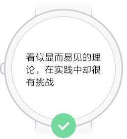
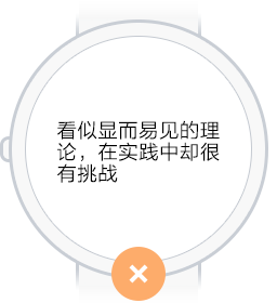
Here are the basic concepts we have summed up for smartwatch UI design. While some of them seem apparent, following them through practice can be fairly challenging. Some of them are principles we ought to follow, but not perfectly embodied in the product yet.
Know through One Glance
Traditional watch users are used to glancing their wrist to check time every now and then thanks to its extreme convenience. As for smartwatch users, the information they get from a rapid glance goes far beyond time, an user experience that matters the most. Thus optimizing this experience through design directly lies in readable, comprehensive text and simple, direct interface.
Be Simple
Smartwatch usually comes with a delicate tiny screen, making it fiddly for users to handle over-complex operations. We are supposed to alleviate the decision-making stress for users by reducing the complexity of operations.
Seamlessly Blend Into Your Life
The smartwatch is not supposed to make any noises at quiet places; it shall leave users alone while they exercise; it can be used for some light reading when we sit and drink coffee. When we design apps for smartwatches, we ought to make sure when users need to lift their wrist and whether it is convenient for them to use the other hand.
Be More Independent
Smartwatch was born in the “smartphone” era. The earliest generation of smartwatch cannot function without a cellphone, leading to a limited usability in our daily life to a certain extent. It shall be great if smartwatches are able to function without cellphones when we leave our phone at home or out for running.
Set Hands Free
Although designing a one-handed operation mode can be fairly challenging and might need more hardware support, insist on doing so. If wearing a watch refrains you from doing other things, why bother wearing it?
A watch. Not a phone.
Both smartwatches and smartphones have touch screen and are designed and developed based on similar operation system. Thus it is easy for us to inadvertently fall into habitual thinking patterns. However, the concept of using one hand to check time through a quick lift of wrist has been ingrained into watch user’s mindset since the very beginning. And that is exactly what a traditional watch was invented for. We then firmly believe that smartwatch should be like a watch, not the other way around.
If an app works better and faster on big screens, we ought to assess whether it is necessary to apply it to smartwatch rather than copying it to the smartwatch without a second thought.
Be Stylish
Timepieces nowadays have transcended their traditional functions, and have become a fashion statement. The same thing applies to smartwatches. Trendy design, exquisite watch faces and elegant software interface are all essential fashion components that matter to smartwatches.
Style
Layout
Designing interface layout for round screen is quite fun. You just cannot help to try some distinctive ways of layout. Meanwhile you will find that many traditional layouts need minor modifications for round screen.
Combination of Interface and Shape of Screen
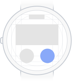
We usually recommend designers to make UI elements align with the screen shape, which helps them make a better use of the tiny screen space and enables a more natural combination of the software interface and hardware appearance. Achieving that could be fairly challenging, while we deem it as the most charming part of the interface design.
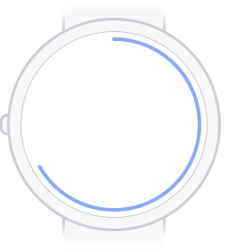
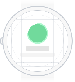
Circular Progress Bar
Circular Boundaries of Page
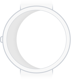
Edge Effect of Page

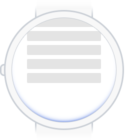
Focusable List
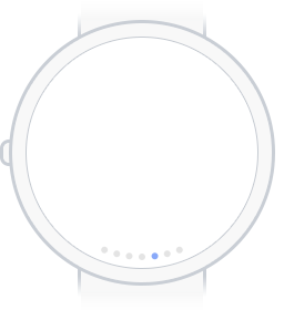
Indicators with Circular Layout

Button Layout
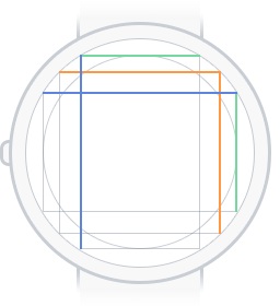
Spacing and Reference Line
Perhaps some interfaces are hard to get modified to fit the round screen well, but they are still easy to understand and aesthetically pleasant. Then what we need to do is to leave some spacing to avoid a constrained/cramped layout and the collision of UI elements. Besides, you are always welcome to select a better layout based on actual design needs.
Guidelines
Layout Example 1
Layout Example 2
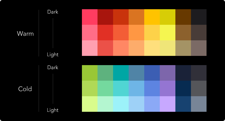
Color
Speaking of color, we do not want to provide too much guideline here to constrain your creativity on design. We do put a few suggestions and the color we use in Ticwear system here, just for your reference.
If we elaborate on the selection and match of colors here, we are afraid that it might go too far. Thus we recommend you to read other files online to acquire more information about color.
Use Black As Background Color
Smartwatch has a tiny screen. Using white as the background makes the screen too bright, and not easy for readers to check information during exercise. Therefore we recommend you to use black (or any dark color) as background for most interfaces. Black as a color, is more energy-efficient on new-tech screens. It helps extend smartwatch’s battery life and naturally blends into hardware as well.
TiColor
Our ideal smartwatch ought to be geeky and trendy/chic. We have drawn inspirations from a series of keywords, such as future, universe, sci-fi movies and edgy technology and formulated a color palette for you. These colors look better on a plain black background.
App Color
Smartwatch interface generally does not have too much content as completing a single task might involve multiple interfaces. The relevance of multiple interfaces for one same app therefore really matters here. To ensure that relevance, you might want to keep the colors consistent within the app.
Appropriate Color Contrast
Do not apply colors with similar hue and brightness for the background and content at the same time. Try to improve/enhance the contrast to make sure that users can read information clearly during exercise.
Typography
Typography is essential to app design. Selecting appropriate font and spacing not only gives readers greater reading experiences, but also ensures a nicer visual display of the app. In order to enable “know through one glance”, we have to pick an appropriate font size to bring good reading experience on the smartwatch, especially under certain circumstances. Most of the time, we recommend you to follow the text layout guideline for the operation system since its developers are more familiar with the characteristics of the hardware that the system setup on.
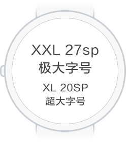
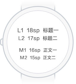
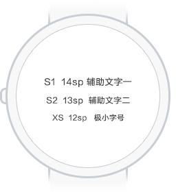
Font Size
Please try not to display more than two fonts on the same interface and keep the distinction between different fonts obvious.And this rule applies to more than smartphones.
What listed below is a whole set of font guideline for Ticwear system, which you might find helpful If you are trying to design an interface on a 36mm smartwatch screen. You are also welcome to refer to the developer doc for more usage guideline.
Row Spacing
The spacing between rows significantly affects the reading experience. We use the following reference: row spacing should be 0.4x the font size.
This is only a consideration. Theoretically, a spacing that is neither too much or too little is acceptable.
English Text
When you need the English version for an app, you are very likely to encounter the following problem: Chinese text message, when translated into English, gets much longer horizontally, therefore disturbing the original balanced layout. This could be solved by the following two solutions:
- Making English text font at least 2px smaller than Chinese text font.
- Use some “condensed” text font: such as Google’s Roboto Condensed
Interactions
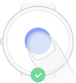
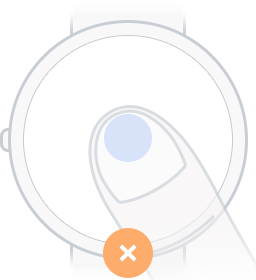
Augment responding area as much as possible
We suggest you to design a safe and pleasant visual and responsive area for UI elements, an apparent rule to follow given the smartwatch’s usage scenarios and product positioning.
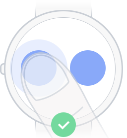
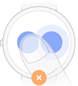
Ensure Enough Spacing
In order to reduce the possibility of false triggering to the greatest extent, we suggest leaving enough and appropriate spacing between any two clickable UI elements.
Natural Response
The response to touch should be obvious and natural that corresponds with human gesture and motion direction. For example, when pressing down, the button should respond with vertical changes; when dragging, the motion of the object should follow the laws of mechanics.
Use Toast As Less As Possible
Use graphs to give response. Keep the description short and simple only if needed.
Animations
Since the smartwatch has a tiny screen, we recommend developers to provide some transitional animations over the process when there are appearance of new elements, redirection of the page, and behavior state in order to help users better understand the page level and the state of the watch. Animation should be as natural as possible to align with all sorts of UI elements.
Regarding animations, we are not very sure how to introduce it in an appropriate way. It is rare to have a noticeable animation with elegant design; meanwhile animation is a battery killer to the smartwatch. Please always keep in mind that animation is the upper level architecture in design, but also the tenderest part of the product.
Warm design, better life.